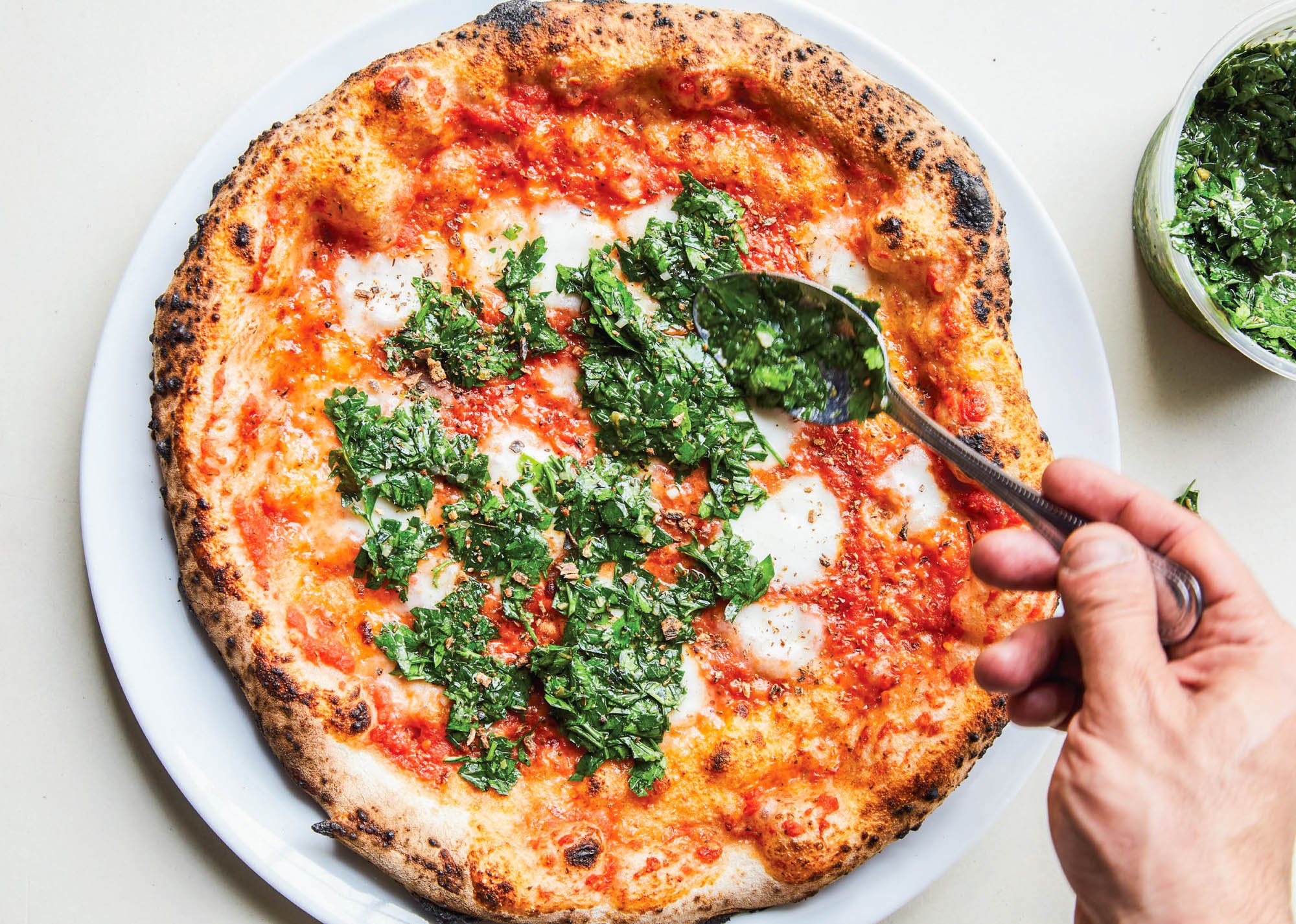
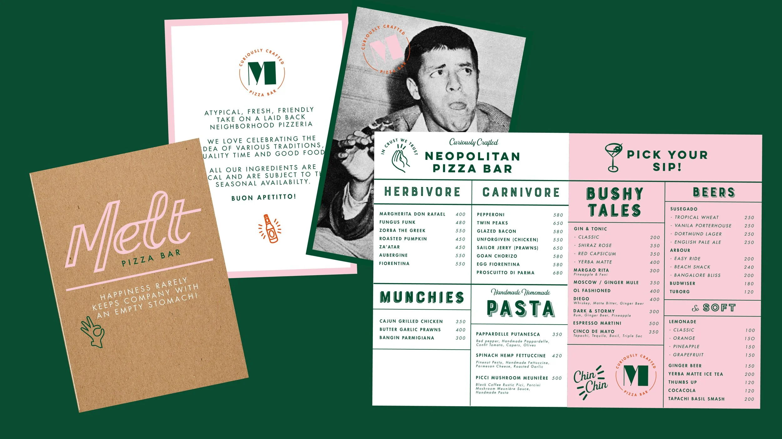
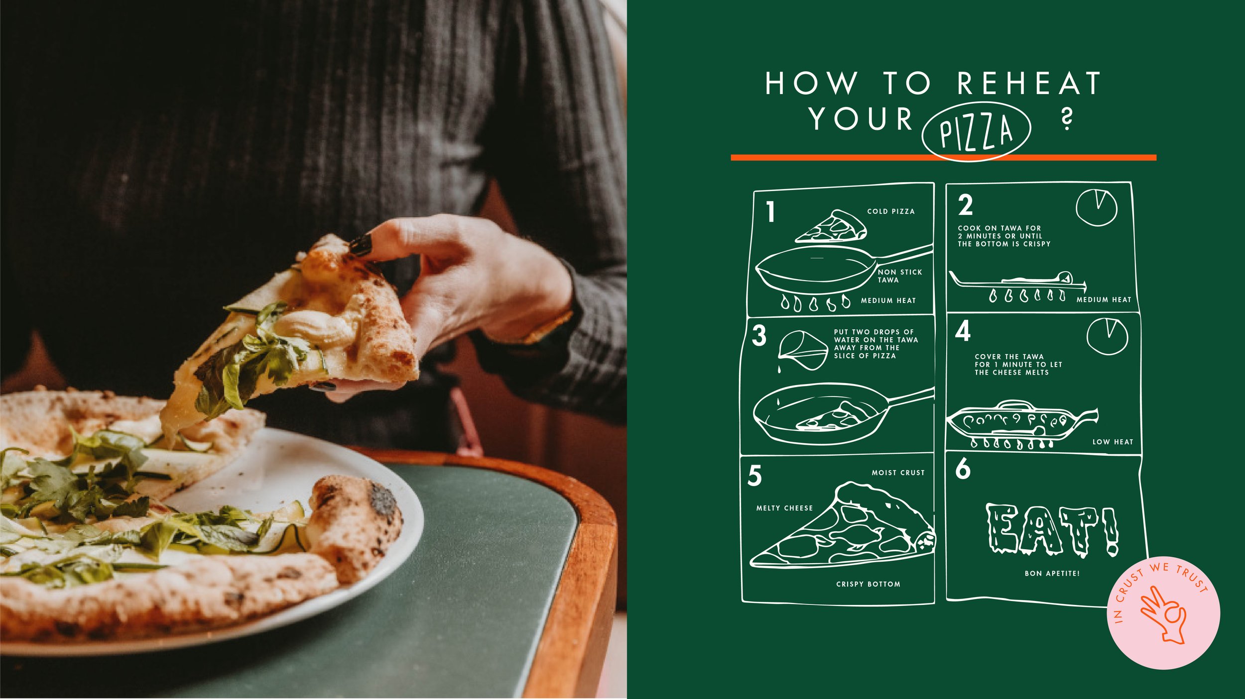
The brand celebrates the pizza process, from selecting the ingredients to making the pizza and the eating experience in various cultures. The brand devised a straightforward yet playful typographic solution with illustration at its core. The characteristic word mark represents the texture of the word “melt” with a retro touch paired with hand drawn illustrations that are distinct making the interaction friendly and approachable. The colour palette is warm, bright and appetising — inspired by the rich delicious ingredients on each pizza.


