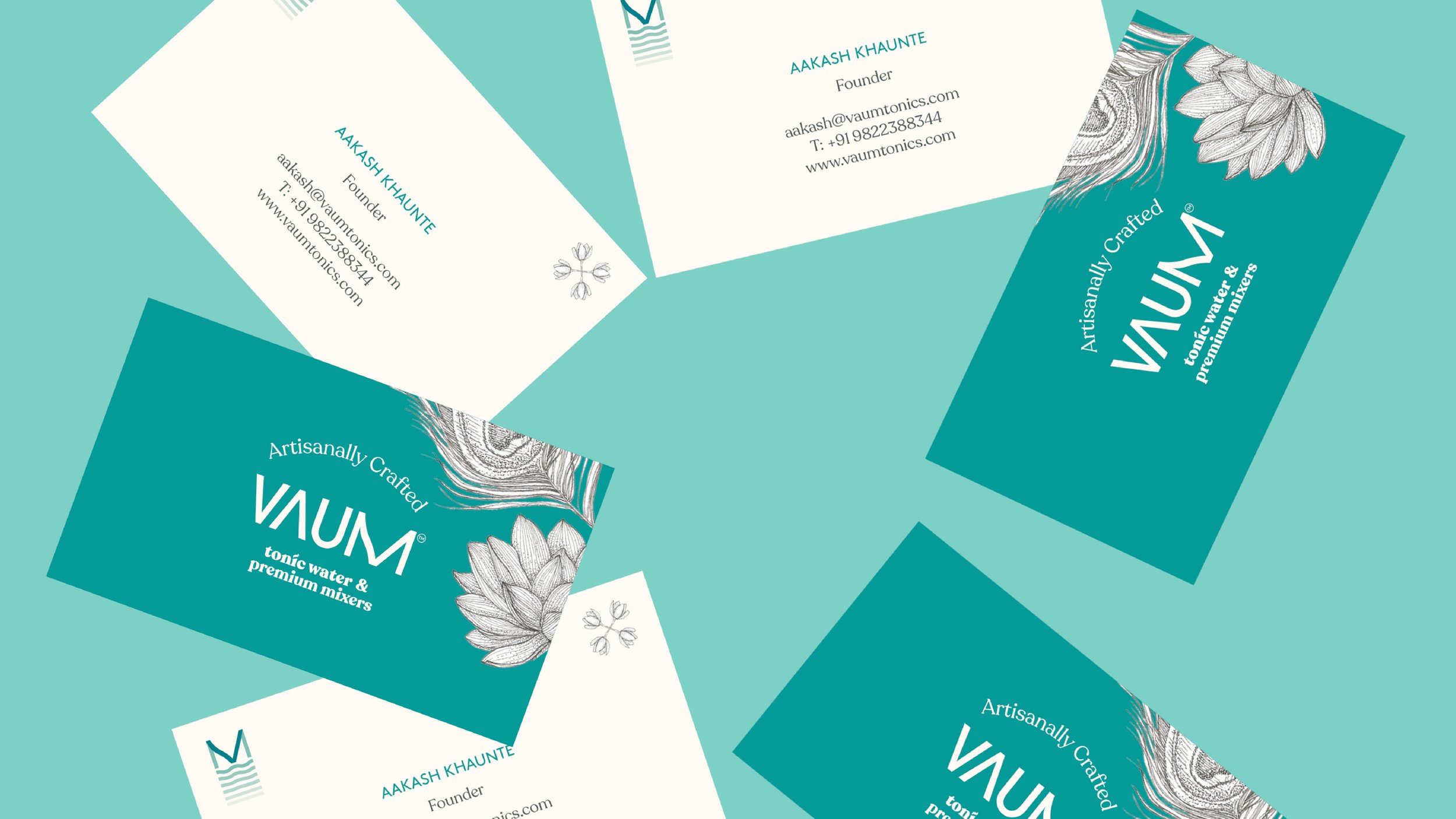
Creating a new and iconic identity and visual design for Vaum Tonics & Botanical waters. Vaum pronounced as “Vah-m” is the rhythm to the sound of water linking it directly to the nature of the product. Vaum’s recipes are crafted in Brighton but made with all natural ingredients from India. The bespoke wordmark is crafted to show movement within the letterforms. The visual language is based on colours and illustrations that communicate a flavour and taste profile while the typography is a combination of an approachable serif and a sans serif creating a contrast between heritage and a contemporary brand identity, yet mixed into one single design that features familiar yet fresh, modern flavours.


